Make your Website Faster
How I made my blog highly performant (according to Google) for mobile devices.
on
In February Goole announced that mobile-friendliness will be used as a ranking signal for mobile searches. To re-iterate, this is just for mobile searches but it will have a significant impact in the results. You can verify whether your website is mobile friendly using the Mobile-Friendly Test too provided by Google.
I had already designed my blog layout with a mobile experience in mind and so fared well in the result of using Mobile-Friendly Test. But what about the speed?
Page Speed
A long time ago Google also noted that they use site speed in ranking in search results (pre-mobile explosion). You can check the speed of your websites using the Google PageSpeed Insights Tool (you can also get this as a Chrome Plug-in). Even for Websites where Google ranking is not a concern, page speed most likely is.
I checked the speed of a handful of pages from my blog and was graded a respectable ~75 out of 100 by the tool for mobile speed.
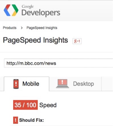
Considering that high-profile websites such as the BBC News Website was (at the time of writing) graded 35/100 for mobile speed, it’s clear that we’ve all got a little work to do!
My speed score was ok but ~25 short of the 100/100 that any nerd expects, so I set to work making tweaks to my blog to make the mobile (and Desktop as a byproduct) faster.
What follows is what I changed.
Form Follows Function
I’ll be the first to admit that my blog isn’t going to win any design awards. I’ve probably removed more that I’ve added in terms of design. The aim of my website is to display articles in a way that makes the text easy to read, so with this in mind I removed the fancy Google Fonts I was using for headings and sub-headings and dropped the banner image that was used across all pages. Removing these items didn’t detract from the reading experience and also made the page loading faster since there was now less image and font assets to be loaded.
To be objective when removing things, keep in mind what is the primary function of a page. Does that 100kb banner image need to be on every page? Does the site really need those snazzy Google fonts?
Don’t use a single Style.css
How do you feel about putting all the server side code into a single file called helper.js/.cs/.java/.py? Exactly. But I admit it, this blog started out with a single style.css that included everything.

One of the things that the Google PageSpeed tool detects is css styles that are “below the fold” i.e. not seen until scroll down or just not needed for the page in question. For example, I had CSS for syntax highlighting in the main style.css which is only needed for some pages and could therefore be loaded asynchronously.
The first thing I did was to break out the css into separate files:
- layout - contains only css for primary layout and not style/fonts/colours/widgets etc
- global styles - limited selection of styles e.g. h1, h2, body font-family
- everything else - (page/feature specific styles, footer styles, syntax highlighting css)
As part of the deployment process the layout and global styles are included in-line within the HEAD tag as to avoid two additional HTTP requests to fetch the css files. The result of this change is that the page in question (or at least the section visible once the page loads before scrolling) can be rendered with the main HTTP request to fetch the HTML page itself.
The remaining CSS for the rest of the page is then rendered asynchronously via JavaScript as to not block the initial page load.
The goal is: one HTTP request to display the main content that’s visible to the user, then everything else async.
Here is the code snippet I added at the end of the pages to achieve this:
var loadCss = function(href) {
	var l = document.createElement('link');
	l.rel = 'stylesheet';
	l.href = href;
	var h = document.getElementsByTagName('head')[0];
	h.parentNode.insertBefore(l, h);
};

var loadAssets = function() {
  loadCss('/css/style.css'); // other styles
  loadCss('/css/code.css');  // syntax highlighting
};

window.addEventListener('load', loadAssets);
It’s a good idea to move all JavaScript includes to the bottom of the page (before the body tag). And don’t forget to minify any CSS or JavaScript files!
Use Image Sprites
A minor change, but again helps to cut down on HTTP requests is to make sprites out of common images such as social media icons. Rather than having multiple HTTP requests for those 1kb icons, condense them into one.
Here is some template CSS for reference (assuming 30x30 icon size):
.icons a {
  height: 30px;
  width: 30px;
  display: inline-block;
  margin-right: 10px;
  text-indent: 100%;
  white-space: nowrap;
  overflow: hidden;
}

.icons #tw {
    background: url('your-icons.png') 90px 0;
}

.icons #gh {
    background: url('your-icons.png') 60px 0;
}

.icons #rss {
    background: url('your-icons.png') 30px 0;
}
Re-sizing Images
A big consideration for mobile device speed and bandwidth is use of images. We can use CSS to make the image resize accordingly, but in many cases the full size image for desktop display is also used for the mobile version, albeit resized with CSS. This means that the mobile user on the slower network and with limited bandwidth has to download the full-size image.
It’s possible to load specific images based on screen size via CSS, but this requires writing the specific CSS each time. Ideally I want to add an image and have the resizing just happen.
I’m still experimenting with my approach to this problem, but at the time of writing I:
- Create three versions of an image using a naming suffix of: -s.jpg (small, mobile), -m.jpg (medium, tablet), -l.jpg (large, desktop)
- Assume mobile first, and thus add the small image via html markup
- Use JavaScript to display the appropriate image based on screen size
I can simply include images as follows:
<img src="myimage-s.jpg" alt="example image" class="resize">
I’ve used the concept on this page. I wanted to use animated gifs in this post but these come with extra bandwidth. For small screens/mobiles, the animated gifs are in fact very small static gifs but for larger screens the full animated GIFS are shown in all their glory!
Using this approach the page is fast by default, the mobile user always gets the smallest image and saves precious bandwidth, and the desktop user may (or may not) notice a slight flicker as the low resolution image is replaced with a higher-quality version.
The code is very simple and I’ve made it available via Github here. I’m still experimenting with this and any additions are welcomed.
The Results
After working through these tweaks I get the following results for a vanilla blog post from my site:
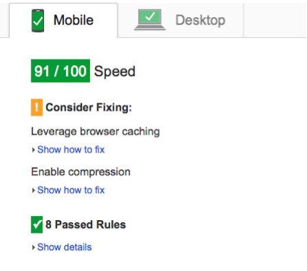
On average, each page on my website scores >90 out of 100 for speed in both Mobile and Desktop speed tests (according to Google). I could improve the score further, but due to hosting options I’m not able to leverage browser caching for images/css.

Google’s tool is of course, only one measure of performance but the suggestions it offers really do make a difference. Granted my blog is a very easy use-case to peformance tweak as it’s just a simple blog designed for reading articles, but if my humble blog can’t be made faster, what hope is there for the enterprise scale apps we’re building in our day jobs!
An excellent tool available within Chrome is the Device Mode & Mobile Emulation, in particular the Emulating network connectivity feature to see how the page will render over a slower connection.
By the way, if you’re wondering what blogging platform I use you can read all about it here.